Google Classroom Design System
What is Google Classroom?
Google Classroom is an educational platform developed by Google, offering teachers and students a streamlined environment to make their classroom digital. With over 150 million users, it simplifies tasks such as assignment creation, submission, and grading, fostering collaboration and enhancing the learning experience.
Overview
Overview & Skills
My role as a UX Designer was to ensure it was up-to-date, comprehensive, and user-friendly. This would lead to increased efficiency for designers and make it more manageable for future design updates to the product, such as updating components to Google’s Material 3 designs. The project spanned several months, during which I led the design decisions and collaborated closely with the design team, along with developing various skills to accomplish this goal.
Role
User Experience Designer
Skills
Designing patterns that can work for X-number of designers
Creating Figma libraries that all designers can use
Receiving feedback from designers & implementing changes
Writing and documenting design guidelines
Cultivating advanced Figma skills and knowledge
Timespan
February, 2023 - May, 2024
This is an example of the system before any updates - Current State
Challenge
Google Classroom's design system is utilized by ~12 designers. While initially robust, it became outdated over time due to numerous product updates. About 60% of components and pages were left in disarray. With the design system being so robust and having over 150 different components, it was no easy task to rejuvenate.
With the current state, efficiency in designing new features for our users or pages were at an all time low. It would also take a lot more time for any future design updates to the product as a whole.
Research
Designing at Google can be complex at times. All Google products follow a centralized design system called Google Material. This is the main hub for more overall guidelines like, colors, typography, icons, buttons, and more. Each product also has their own design system. This is where the design team would find the components tailored for their product.
So what’s the issue?
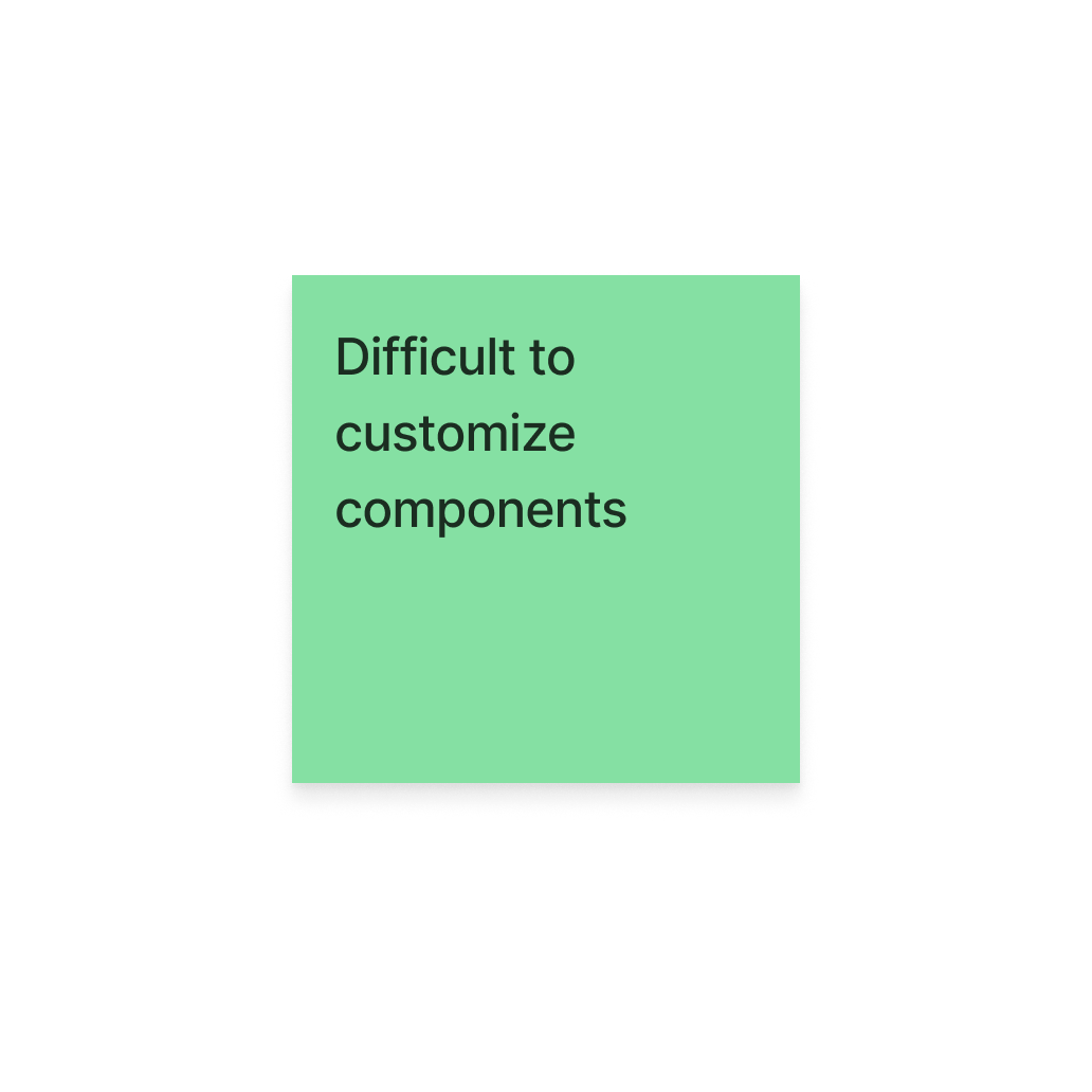
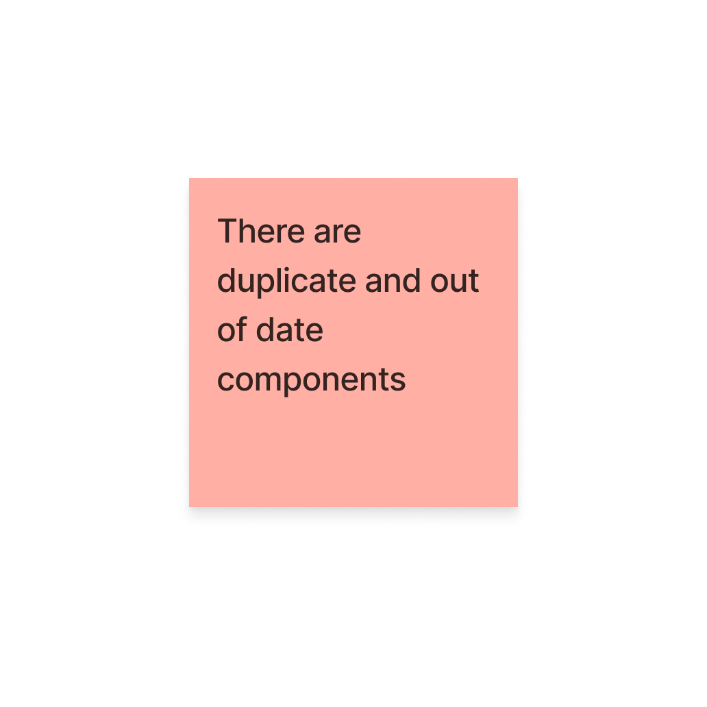
Who better to ask than the designers themselves? These Post Its showcase feedback given from the UX designers who use the design system on a daily basis. I was also taking over an ongoing project so the following research was conducted by the previous project owner and documented in the brief.
Some major pain points to highlight are the out of date components and the missing screen templates. These are leading designers to need to recreate screens or components every time they work on a new feature.
What does this mean?
Google Classroom urgently needed an updated and complete design system. The existing one was obsolete, hindering designers' productivity and causing inconsistencies across the platform. Addressing this problem was crucial both for improving the designer experience and streamlining the design process, ultimately benefiting both designers and the business by improving usability, streamlining workflows, and aligning with Google's Material Design 2 guidelines.
Design
Starting with core Classroom screens
Adhering to Google's Material Design 2 guidelines, I started meticulously crafting web mocks for Classroom, ensuring pixel perfection and adherence to Google’s centralized design principles.
The Templates
Starting with previously documented screens, I reviewed and identified outdated elements that required cleanup. This would allow me to make considerable progress with all of the components, while focusing on having the templates ready to use for designers throughout the process.
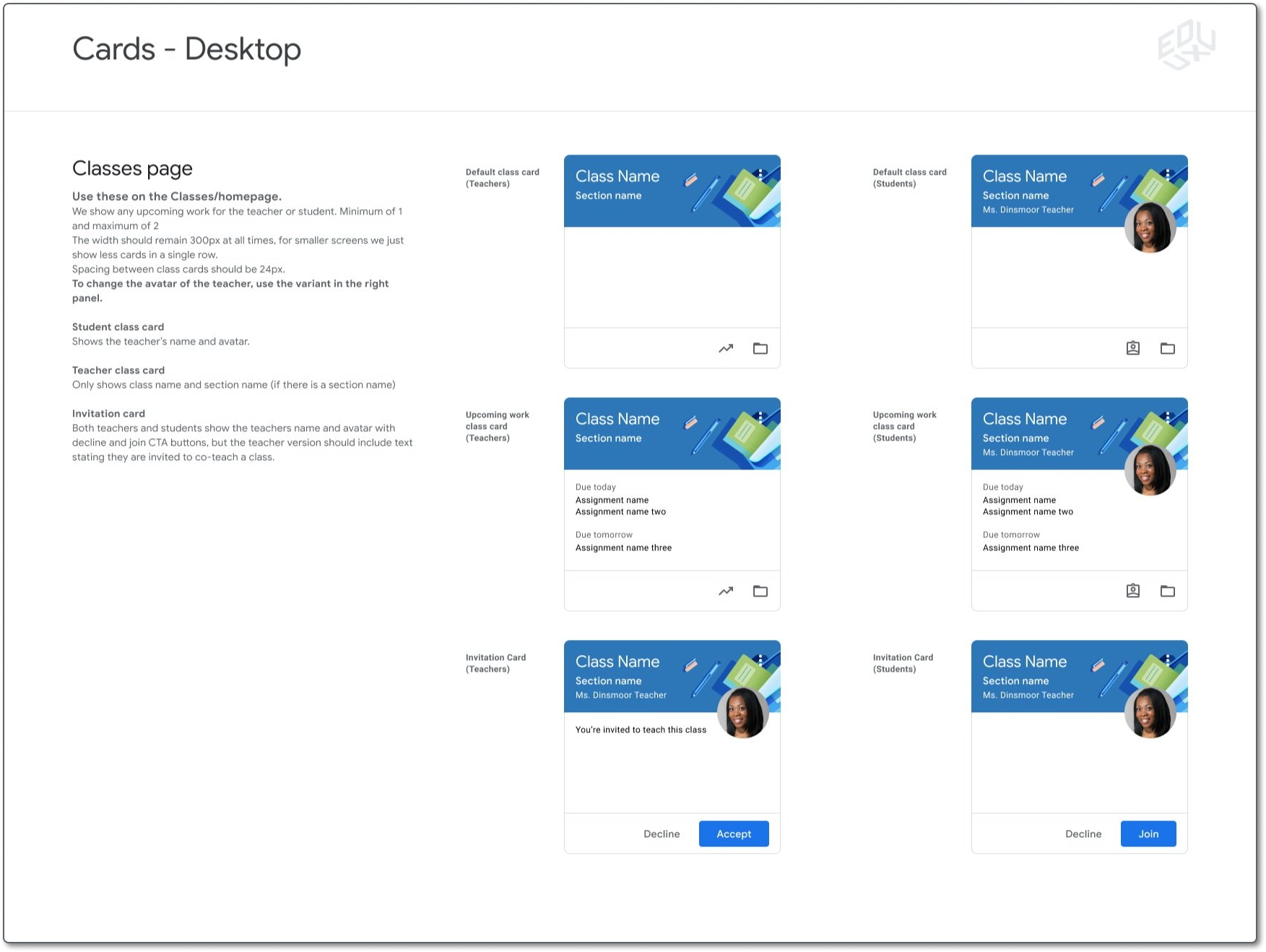
I gradually progressed through the project, beginning with the core Classroom templates. Each template has to show a fairly good range of alternative states / views that are commonly used in Classroom. As seen below, there are alternative states for each of the cards and ready to use content for each.
Before
After
The sections highlighted in pink, show some of the updates done to the template. (Shown in the screenshot)
Responsive Design
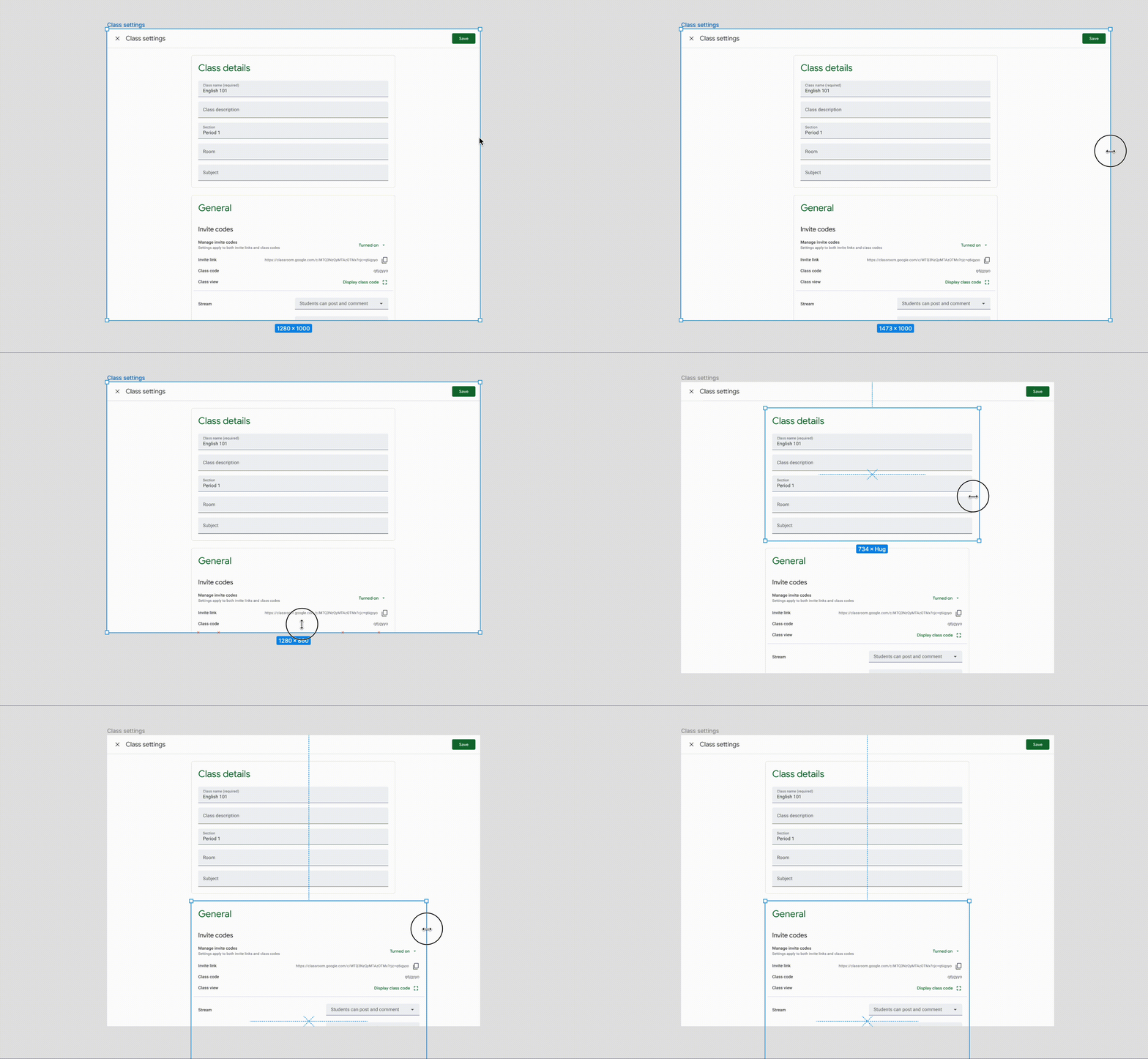
These screens need to be easily resizable so designers can pick them up quickly when starting a new project.
As I was going through to set the proper constraints, I was also able to adjust any Classroom-specific styles and components, ensuring all basic components, icons, colors, and text styles are linked to our Google Material Design file.
Not only that, but since Classroom is used by teachers and students, each template needs a teacher view and a student view.
These templates provided a foundation for designers, eliminating the need to create screens from scratch, making it easier for us to get new features out to our users.
Teacher
Student
Finishing with Components & Stickersheets
While creating those templates, I consolidated and created components for any objects that are used commonly across Classroom.
Leveraging Figma's auto layout feature facilitated flexible resizing for responsive designs. This was the first major hurdle I had to get over.
Balancing simplicity with functionality was a challenge, but keeping auto layout in more simple cases was imperative. Adding too much auto layout to a component can cause frustrations for other designers not too familiar with the feature.
It’s just a balancing act
However, for components with numerous moving parts, more auto layout ensured easier customization while maintaining specific design patterns like spacing and padding.
For this component, designers can remove or add any elements (within the purple frame) with a click of the button and the auto layout will ensure the correct spacing and padding is still used.
Staying informed
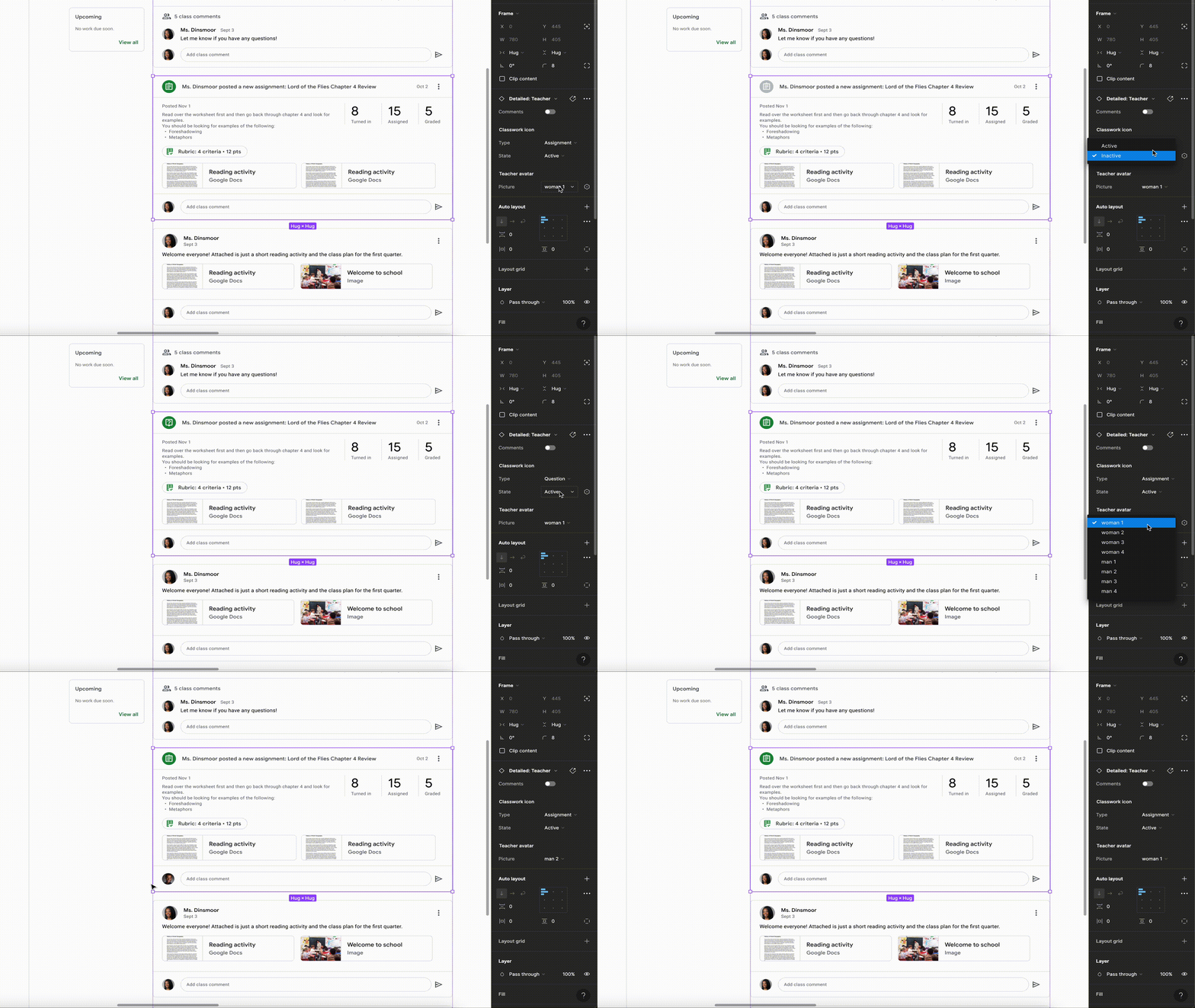
Throughout this process, I would inform myself on Figma's continual updates introducing new features, offering more options for customizations using variants.
Using a new feature, you can change a component within another component with a single click, as seen in the example.
The Final Product
Finally, all components were compiled into a sticker sheet, complete with explanations on when, where, and how to use them, ensuring consistency and ease of access for designers. Making sure to document design patterns used throughout Classroom.
I made sure to document any component behavior, including differences between the variants and even how to customize them. Notes on what page they should be used on and how different class settings can change which components to use were also listed in the sticker sheets. This way, any designer can pick up the designs and know how to use them, even if they are new to Classroom.
Templates ✅
Responsive Components ✅
Stickersheets ✅
Testing
Here’s the plan
This project is still ongoing so testing has not been completed yet but outlined below is the plan I will be moving forward with in the next couple of weeks. Since the screens and components were updated for the whole team throughout the process, there was some feedback given already.
Experiment type
Unmoderated Usability Study
Targeted Participants
Advanced user
Intermediate user
Novice user
I want to put the designs in front of the designers and get any tiny bit of feedback I can. I expect to receive feedback specifically on any documentation and layout of the stickersheets, along with the usability of any components used in the study.
I want to make sure to test everything at these different levels of proficiency since our team has such a wide variety of designers.
This would be a moderated study where we ask the designers to look over the different stickersheets and be asked questions pertaining to the layout and structure, documentation on where and how to use components, and general understanding of use cases for the components and screens.
Participants will then be asked to create a new feature (specified in the study) within the specific templates given. Thinking out loud as they are designing, they will also be asked to clarify their reasoning if they need to detach any components or disable any auto layout.
Iterations would be made based on any feedback given.
Number of Participants
3
The Impact
How did this benefit us?
Before:
Designers had to recreate screens, leading to inefficiencies.
Customization of components was cumbersome, slowing down the design process.
Difficulty in updating components and ensuring consistency across the product.
Revamping Google Classroom's design system was a challenging yet rewarding endeavor. By prioritizing the designer’s needs, I successfully modernized the design system, enhancing both designer experience and operational efficiency. Allowing us to create new features for our users quicker.
Making these updates not only helped designers be more efficient and helped the business be more consistent, but in tandem, helped the users. Since designers are able to create designs and iterate on screens more effectively, we are able to get more of the top feature requests from our users out to them quicker. Along with that, when Google Classroom looks to update their components to align with Google’s Material Design 3, it will be a much simpler and faster process than it would have been before. Taking a project that could span over a year, to just a couple of months.
After:
Components became easily customizable, speeding up the design process.
Updates to components and the product became quicker and more manageable.
Consistency in design was improved, facilitating the creation of new features.


