The Art Institute of Chicago
Bringing the in-person museum experience to your pockets.
What are they looking for?
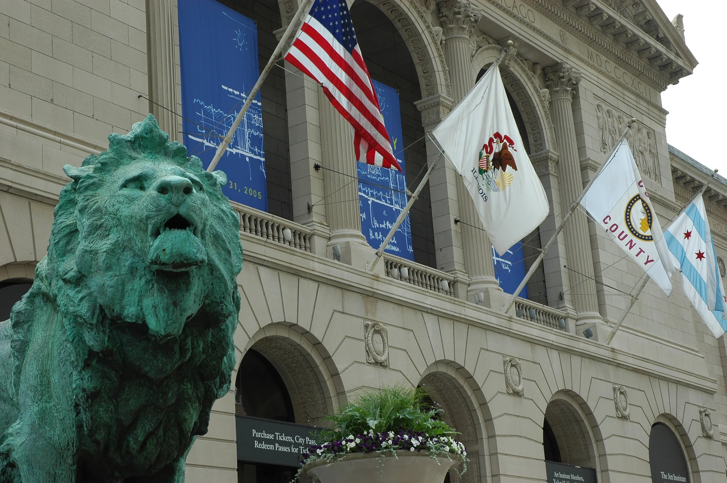
The Art Institute of Chicago is an art museum that hosts about 1.5 MILLION people a year. In March 2020 they were forced to close their doors due to the pandemic. Without visitors they saw major cuts to their overall budget and staff. They are looking for a way to make their virtual and interactive programming available to everyone across the United States. My team was tasked with establishing user needs and creating a mobile prototype to bring the in-person museum experience to the users.
Deliverables
User Interviews
User Personas
Competitive Analysis
Comparative Analysis
Feature Chart
User Flows
Wireframes
Sketches
Hi-Fi Mock Ups
Clickable Prototype
Usability Tests
Tools
Figma
Maze
Trello
Zoom
What’s the Challenge?
When you think of visiting a museum, you probably think of being there in person. And you’re not alone. Most people love to experience museums in person where they can interact with it and connect with the art community. But with the global pandemic they don’t have that ability anymore.
The Art Institute of Chicago needs a way to increase interactivity so that the art patrons can connect with the art community, and encourage collaboration. Due to the pandemic, the volume of visitors has swiftly decreased, and patrons have less avenues to share and learn about art.
How are we going to solve this?
Solving this issue was not going to be easy. There are many factors to consider and let’s be honest there nothing better than experiencing a museum in person.
But by creating a mobile website that will make the artwork in The Art Institute of Chicago more accessible and interactable will allow users to better understand and connect with the art, and other art patrons.
Discover
Interviews
Objective:
Our goal was to interview frequent museum visitors and identify common aspects they enjoy and look forward to when going to museums. We are looking for some kind of pattern to help come up with a feature to add to the mobile website that will suit their needs.
Findings:
We noticed many visitors like to bring their kids as a fun activity for them. They want their kids to interact and enjoy the museum. They love when their kids get to learn and have fun at the same time.
They want to connect not only with the art but with the community around it. They love to feel included when visiting and interacting with the art.
From this we began getting a picture of what we should add. We need to focus on keeping children included, connecting people with the art community, and making things interactive.
Competitive Analysis
Objective:
When looking at competitors we wanted to focus on the different features that worked well for them and even the ones that didn’t.
Findings:
We took a look at some of the top museums around the world and this is what we found.
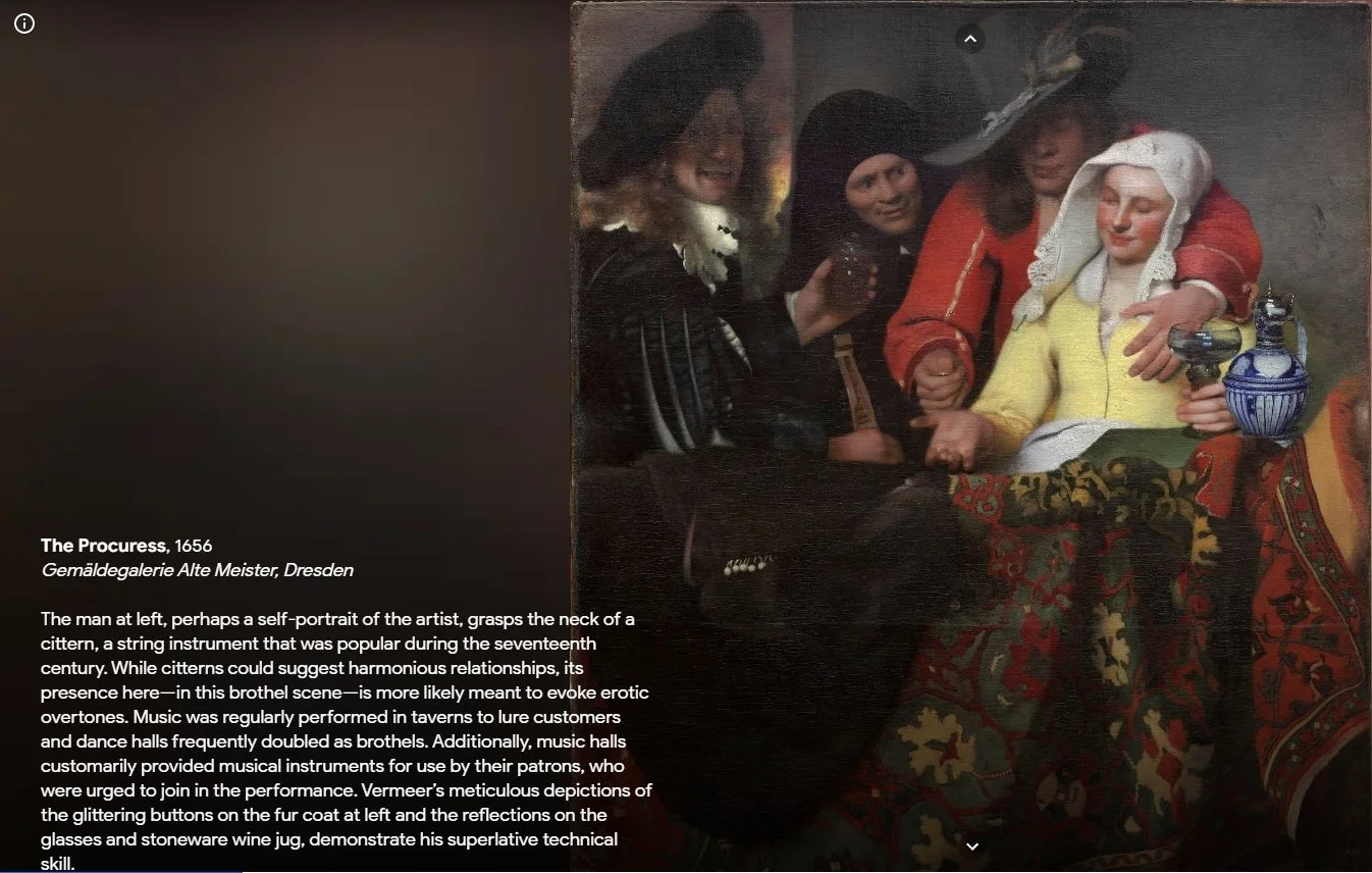
Going through we noticed a lot of these museums “virtual tours” we from Google’s “Art and Culture” section. Which worked well and all but it was just a lot of mindless scrolling and reading.
All of the museums incorporated pictures but rarely did they use videos.
Some museums used timelines as a way to navigate the “tour” which was a great way to help people navigate.
Take aways:
Exploring all the different museum websites gave us some great insight.
None of them really had an interactive experience within them so adding that to the Art Institute of Chicago’s website will help them stand out. Including videos to the experience will help change the pace of scrolling through text.
The way some websites use a timeline to help people navigate is a great way for people to go back and find what they were looking at.
Including the ability to share your favorite art pieces to your social media is a great way to get connected with the community.
Comparative Analysis
Objective:
When we were doing our comparative analysis we were trying to think outside the box. Maybe get some ideas that can be used in a different way and use them in this design.
Findings:
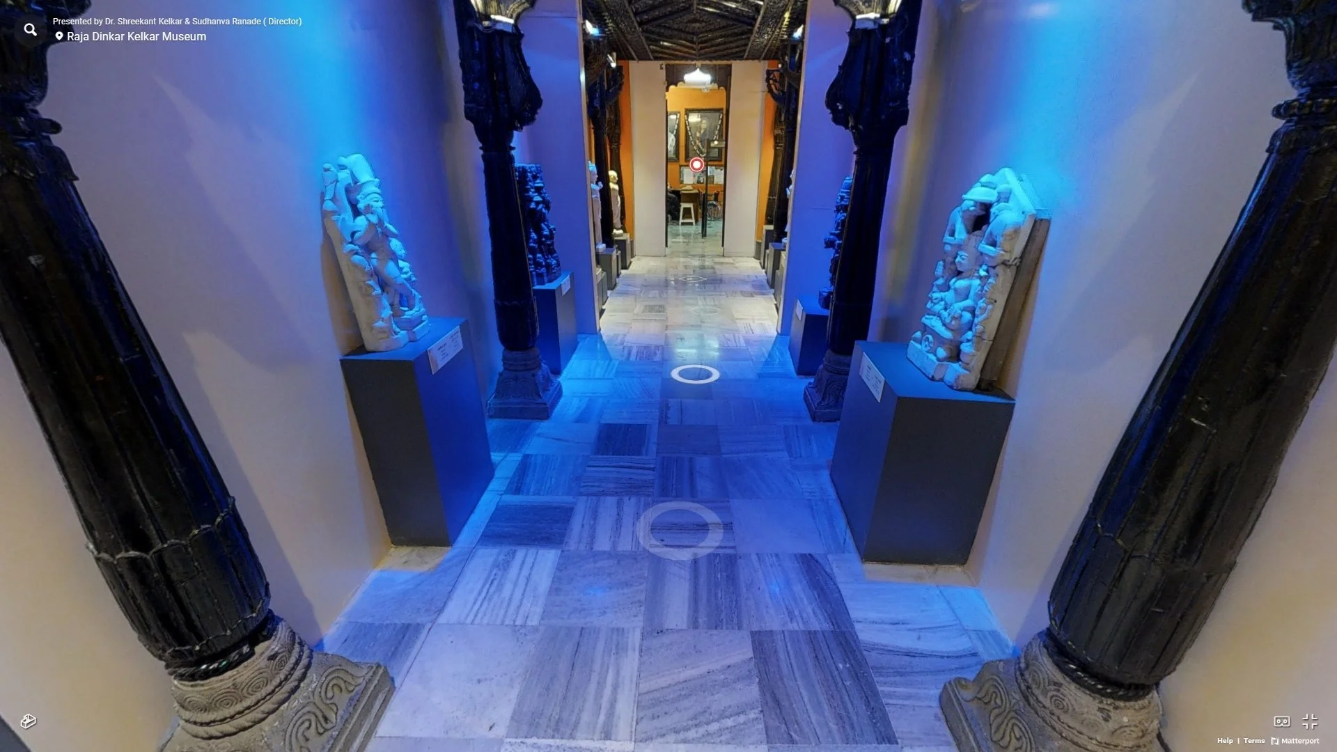
One of websites we took a look at was Matterport. Matterport is a virtual tour service that helps users create a virtual walk through of your house, store, or in this instance, museum. Think of it as Google street view but inside buildings. The way it works is, you take multiple 360 degree pictures in different spots. Those different spots you take them from act as “touch points” and will be the perspective on the user standing in that section.
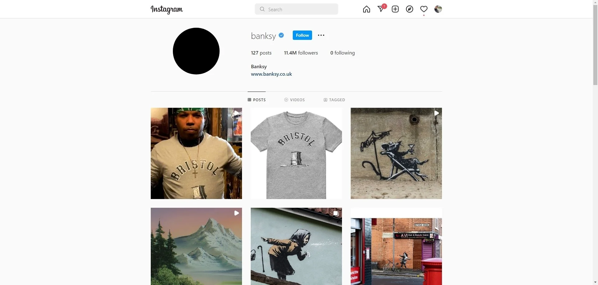
Another website we checked out was actually a famous artists Instagram. This artist does have an official website but does not have any of his pieces showcased on there. Banksy is a street artist and posts a picture of most of his art pieces on his instagram. This gives his followers a sense of community since they are able to interact with him almost directly. He also has events sometimes and if his followers are in the area they might even spot him!
Design
Let’s Get Started
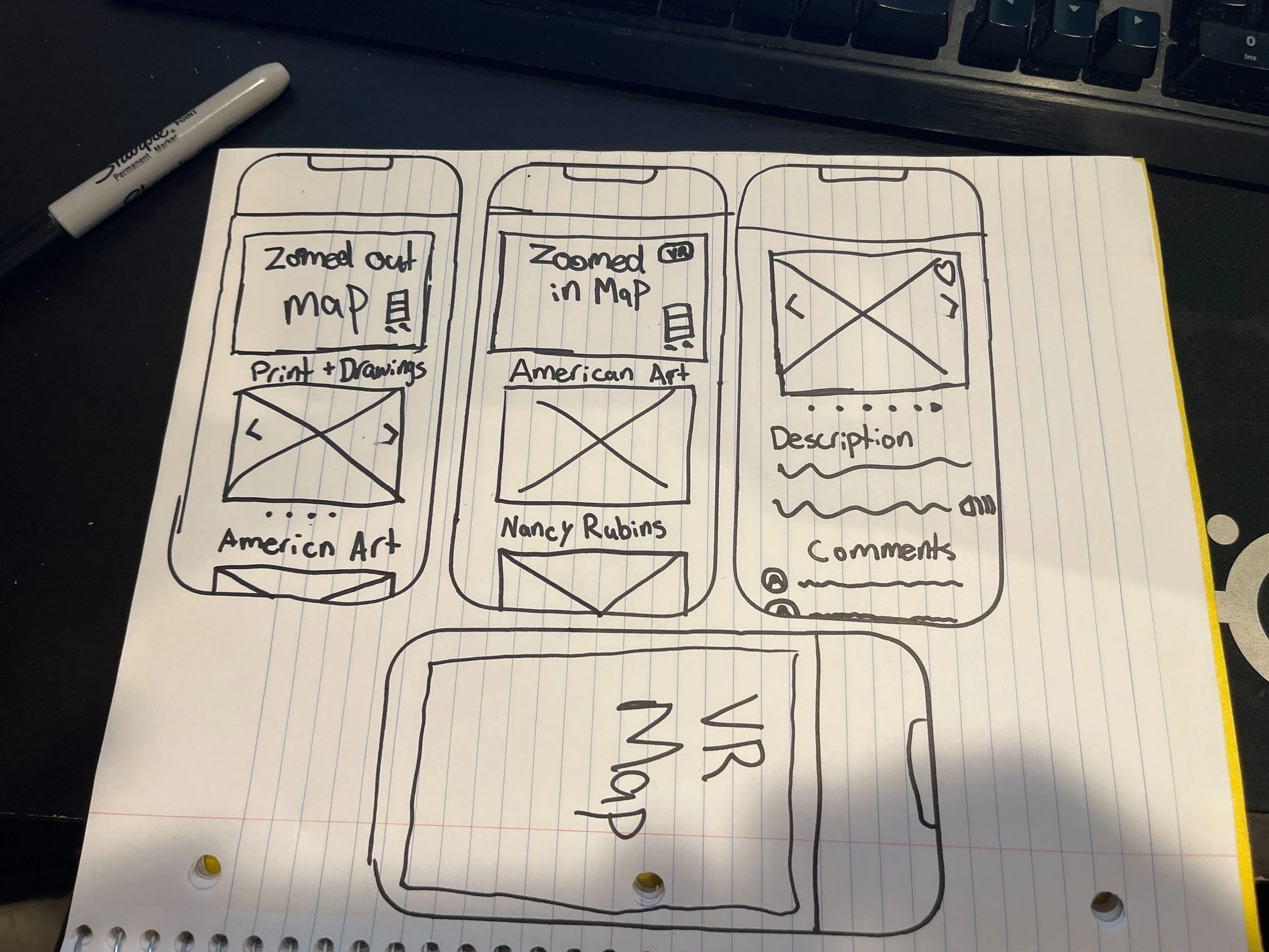
After our interviews, creating our personas, and making our user flows we decided to start with a quick design studio. Each of us took about 10 minutes to sketch out a few screens that we think would fit into the design. Keep in mind these sketches were very rough sketches and were basically just to get the ideas flowing.
After we sketched out a few ideas we would share them with each other and talk about what we think works and what doesn’t. We tried to come up with an easy way for users to navigate through the experience. Taking ideas from the timeline features we saw in our competitive analysis, we drew out a couple of different timelines to see how we liked it. We ended up coming up with making a map of the floor plan and have the users navigate through that and make them feel like they are in the actually museum.
Then we wanted to focus on the art description page. Here we wanted to focus on making it interactive to keep users engaged. We knew we wanted to incorporate some video or at least some audio in there. After working through a couple of screens we were stuck. We had no clue how we can keep people engaged. Then we realized, what do most people now a days have in common? Social Media.
We took great inspiration from Instagram and other social media sites when designing the art description page. Designing it this way would keep not only the older users engaged but also the younger users as well. With add the ability to share art to your social media and adding a comment section, it helps the users connect with the art community.
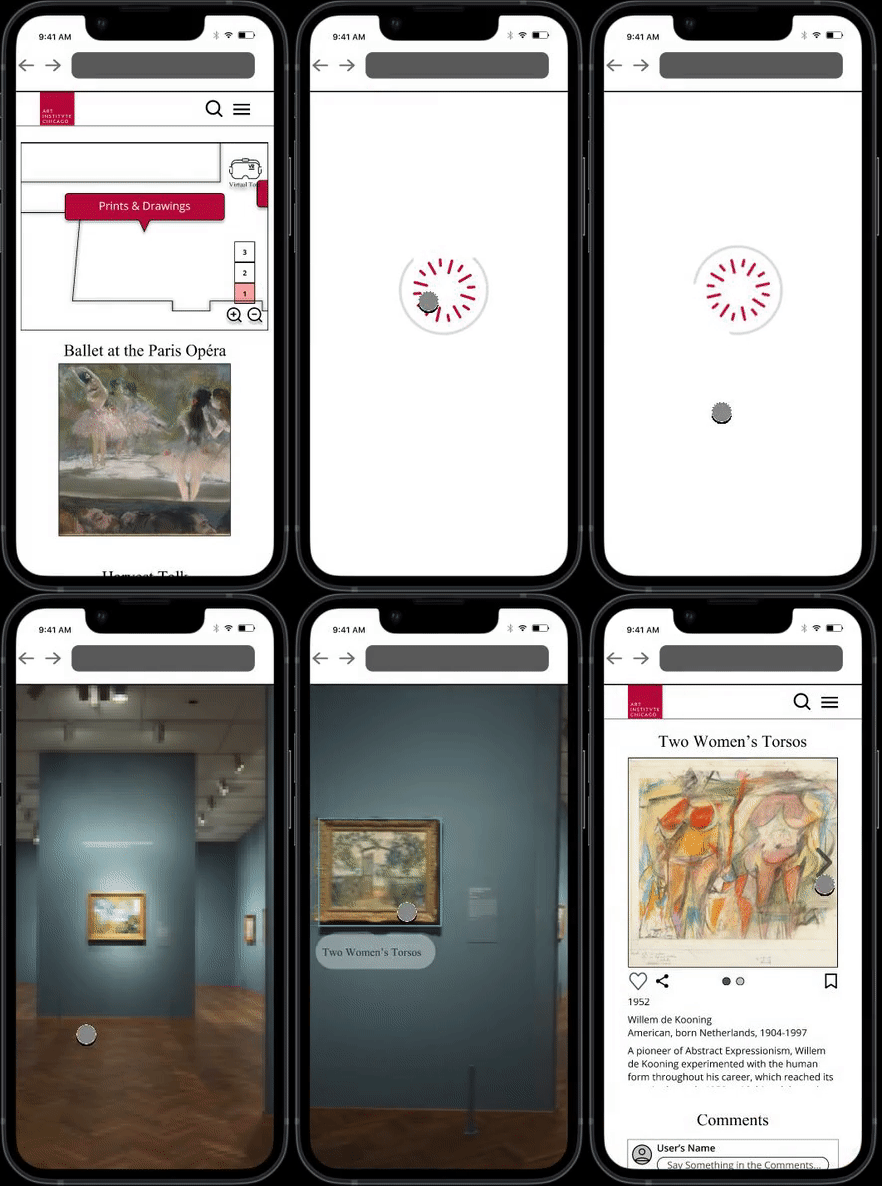
We also wanted to make it feel like you were actually in the museum. What a better way to do that than actually putting you in the museum. Going back to our comparative analysis, we wanted to make a section where you can virtually walk through the museum, placing you in a virtual version of the museum.
Getting it on a screen.
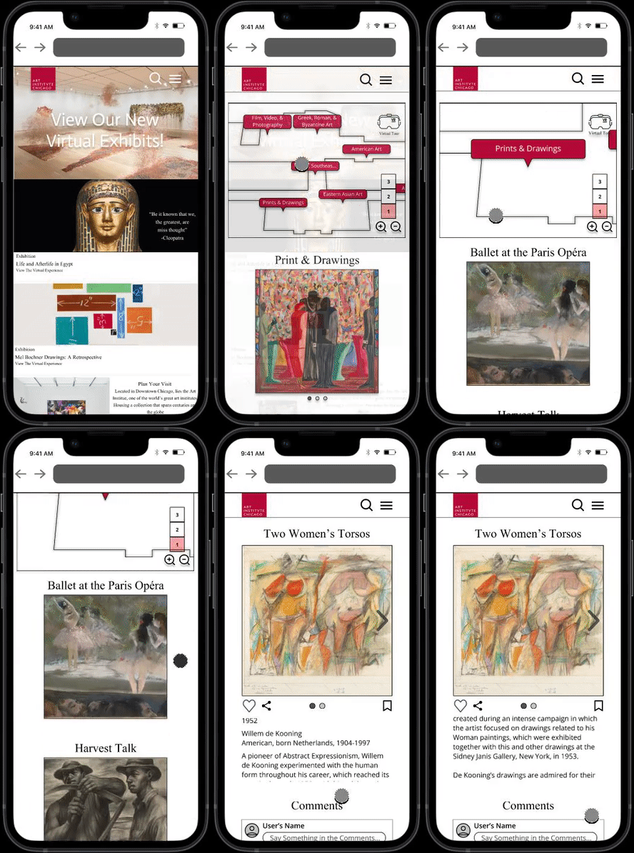
Now that we had some solid ideas down on paper it was time to start our wireframes. First we began with creating a style guide. Since there was no style guide set up we used some resources to determine the 2 main fonts that they use throughout their website and their branding colors.
Once that was finished we started got the basic layout finished. My main responsibility was the map and the art description page. For the rest of the team we had someone focus on the home page, one person creating the virtual reality page, and the last person as a floater, providing help where it was needed.
While designing the map the biggest challenge was the size of the buttons to navigate. Of course we want them big enough for people to see and press. But we also wanted them to still see and feel like they are looking at a map. So we tested it out ourselves to see if it felt good to us. We knew we were stilling going to do our usability test and that was something we wanted focus on when doing it.
Underneath the map we had the idea to showcase the different sections that were labeled on the map. We also knew that if something caught someone’s eye they would click on it, so we made them clickable! This would also help with users that may not have the best sight to read the text on the screen.
We also added the zoom in and out buttons on the map to show users that you can zoom in using that but also naturally on the phone they may try to pinch the screen to zoom. This also helps bringing the design over to a desktop site. It makes both the mobile and desktop design feel cohesive.
Prototype
Let’s make it look good
Okay now that we had the structure done it was time to make it pretty. We did some usability testing with our mid fidelity wireframes focusing on the navigation and making sure people didn’t get stuck. We wanted the flow to be lean and natural.
The results were good overall. With 80% of our users rating the experience over a 4 out of 5. The other 20% rated it a 3 out of 5 because they had difficulty finding the virtual reality button. So we changed the virtual reality logo to be a bit more noticeable and added the text “Virtual Tour” under it to have it clearly labeled.
So after changing those small things we began transitioning to our Hi-Fi clickable prototype. Following the brand colors and filling in the art work previews, everything was looking great! The only design we came into a road block with was the map. We wanted a way to make the map stand out more with out causing too much clutter. With time being a constraint we decided that would be completed at different time. We wanted to focus on the art description page and the virtual tour option.
After completing our clickable prototype we did some more usability testing. These results were also overall positive. Every user was able to complete each task. The only issue some users had was the spacing with some titles and images were too close so they were confused on what title went with which art piece. They also felt the art description page was very familiar and it was natural for them to interact with.
Users also had no trouble finding the virtual tour option on the map any more. They also had no difficulty navigating the virtual tour. They felt like the virtual tour was rather seamless and intuitive to navigate. They loved the immersive feeling of being able to walk through the museum like they were actually there!
Next Steps
No Design is Finished
-
Due to the time constraint we could focus on how the map looked for as long as we would’ve liked. I would love to continue working on making the map stand out a bit more and make it look more cohesive with the website design.
-
The virtual tour is one of my favorite features. Everyone knows now a days more and more companies are trying to get into the Virtual reality and augmented reality scene. With this virtual tour option, it opens doors for new partner ship with companies and even artists that focus on digital art. This would create an entirely immersive experience that can stick out from the rest of the competition.
-
During our interviews a couple of them mentioned how a lot of museums have live speakers that come in to talk about the art and the history behind it. In the future we think this would be a great feature to add and help people connect with the community more.
What to do in the future.
I put my all into this project and I am very happy with what we came up with and created. But with every project and design you will always come across some mistakes that you made. So here are a couple of tips after reviewing our mistakes.
Time Box. Time Box. Time Box. Don’t get me wrong we did very well with out time management. But in the case of the map I would’ve liked to only spend 10 minutes when I started feeling stuck that way I would actually have time to come back to it and with fresh eyes.
Download the Figma App on my phone. The cool thing about downloading the app on your phone is you can really get a sense of what it will look like in your hand. Not only that but being able to click with your figures instead of a mouse helps you gauge the text and button size more.
Interviews are better in groups. with our interviews they were just 1 on 1. What I would like to do in the future is have multiple people interviewing so you can have 1 person asking the questions and a couple of other people taking notes on the answers.
Live in-person usability tests give you a lot more information than using maze. Maze is great if you just want to test navigation but in regards to visual hierarchy the in person tests gives you more insight on that.
Looking back through the project, I am confident this would be excellent solution to bringing the in-person museum experience to everyone’s pockets.

