
Student Groups in Google Classroom
What is Google Classroom?
Google Classroom is an educational platform developed by Google, offering teachers and students a streamlined environment to make their classroom digital. Teachers can create and assign work to their class or even to individual students.
Overview & Skills
Teachers with large classes lack a way to group students in Google Classroom. Currently, they must individually select students for each assignment. The "Student Groups" feature, a top user request, addresses this need for differentiation—adapting coursework to student needs.
As the UX designer, my role was to create a way for teachers to organize students into groups and assign work to those groups. Collaborating with a cross-functional team, I led a mini design sprint to generate ideas and map them based on user value and engineering complexity. We took high-value ideas through sketches, wireframes, and high-fidelity designs, iterating based on feedback from usability tests.
Role
UX Designer & Researcher
Skills
User Research and Analysis
Collaboration and Communication
Project Management
Usability Testing
Problem-Solving
Timespan
April 2023 - May 2024
Throughout the process I would bring the designs to design crits, as well as present them in our weekly meetings for additional feedback. I then worked closely with the UXR lead to run a usability test with my robust prototypes of the designs and iterated based on the feedback we received. It was a long journey filled with approvals and pivots but with some strong communication across the team our final designs were approved and ready for implementation.
Before

Being that this would be a feature only for our premium users, we plan on seeing an increase in premium feature adoption (a goal we have been striving for across the Google Classroom platform as a whole). Along with an increase in premium sales and customer longevity as we continue to create features for differentiation in the classroom. Dive deeper into this journey with me as I go into more detail about how I completed this project.
After

Understanding Our Users
Foundational Research
Student groups has been a top feature request from our users for quite some time. At first glance the requests seemed pretty cut and dry, “We need a way to group our students”. But I wanted to go a bit deeper into WHY they wanted that.
I took a look at some previous research we have done in that past, anything that mentions grouping students. After going through those and taking a deeper look into the feedback directly from our users, It was clear that teachers were looking for more opportunities of differentiation in their classroom.
I used all this information, including a landscape analysis of 8 similar products, and ran a mini design sprint with the cross-functional team. There we took the time to generate ideas together and map them out based on user value and eng complexity. I knew we had some great ideas but due to time wanted to rule out what was a need to have and what was a nice to have. Later on I circled back with the lead designer and PM to finalize our critical user journeys. That way we were all on the same page for what we are expecting from the feature and would later reference this when creating the PRD.
“It would be great to have a feature to group our students for differentiation.”
“Can you add a feature to group students and assign to those groups?”

Concepts
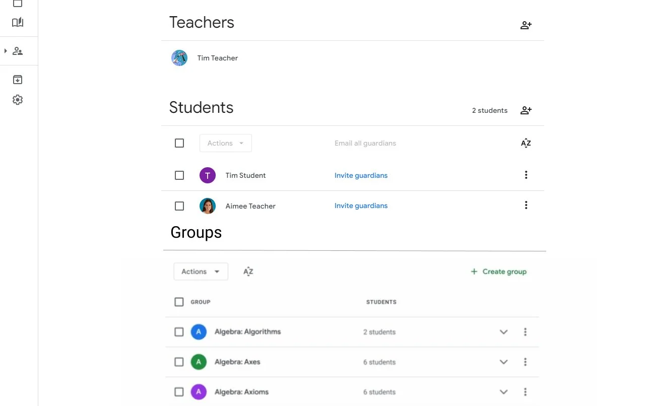
First version of the people page
Wireframes
Now that I understood what our users want and what is feasible, I took the ideas and ran with them. Focusing on the main purpose of the feature, creating student groups. First doing some sketches but then moving onto wireframes of what it would look like when creating and assigning to a group. These are both the main flows we wanted to focus on in our concept study.
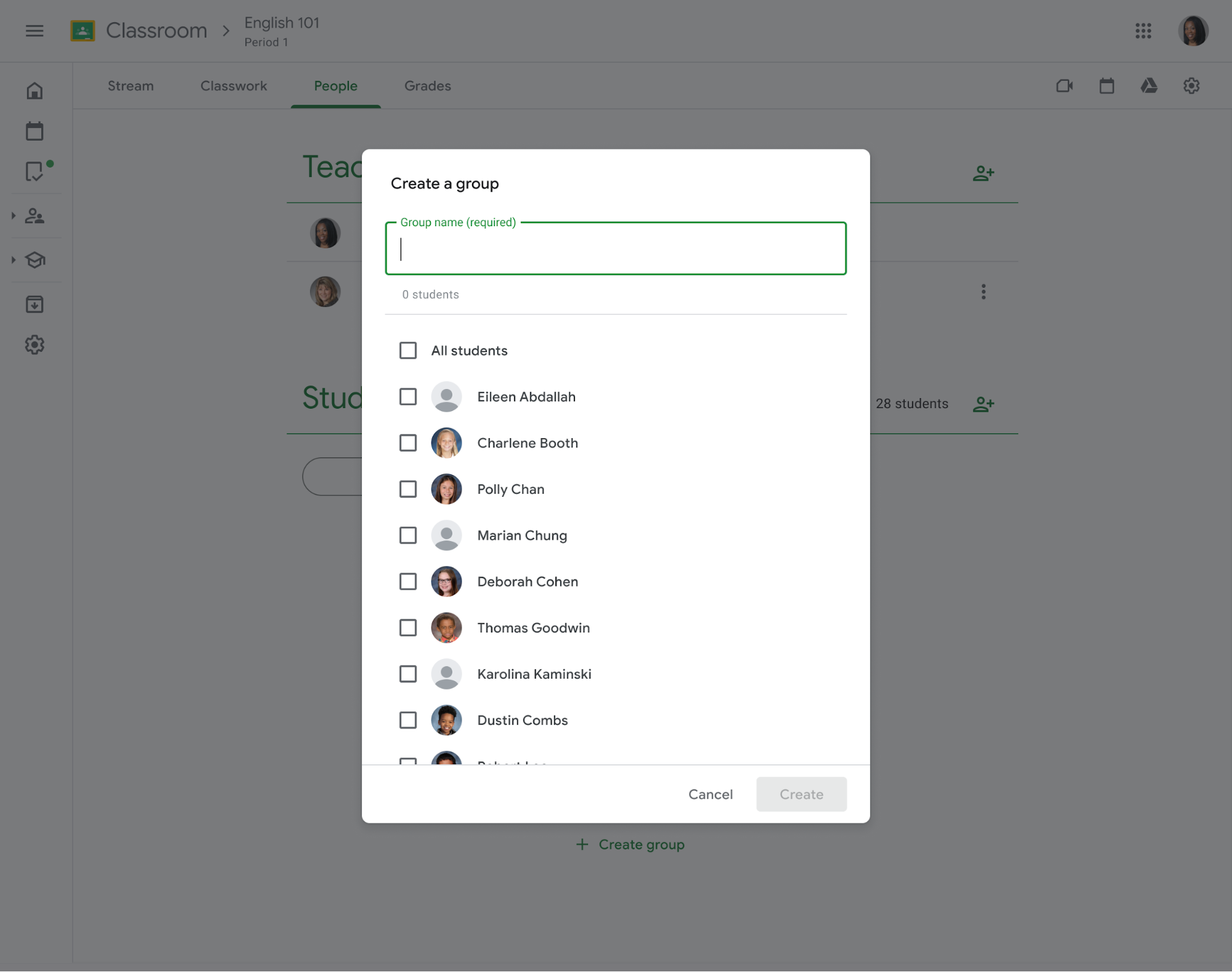
Deciding to put the main access point on the people page since this is where the student list lives and this is where teachers manage their roster.
Teachers could create groups and select which students would be in those groups. When a student is selected they would pin to the top. To remove a student from a group you would simply uncheck them from the list.

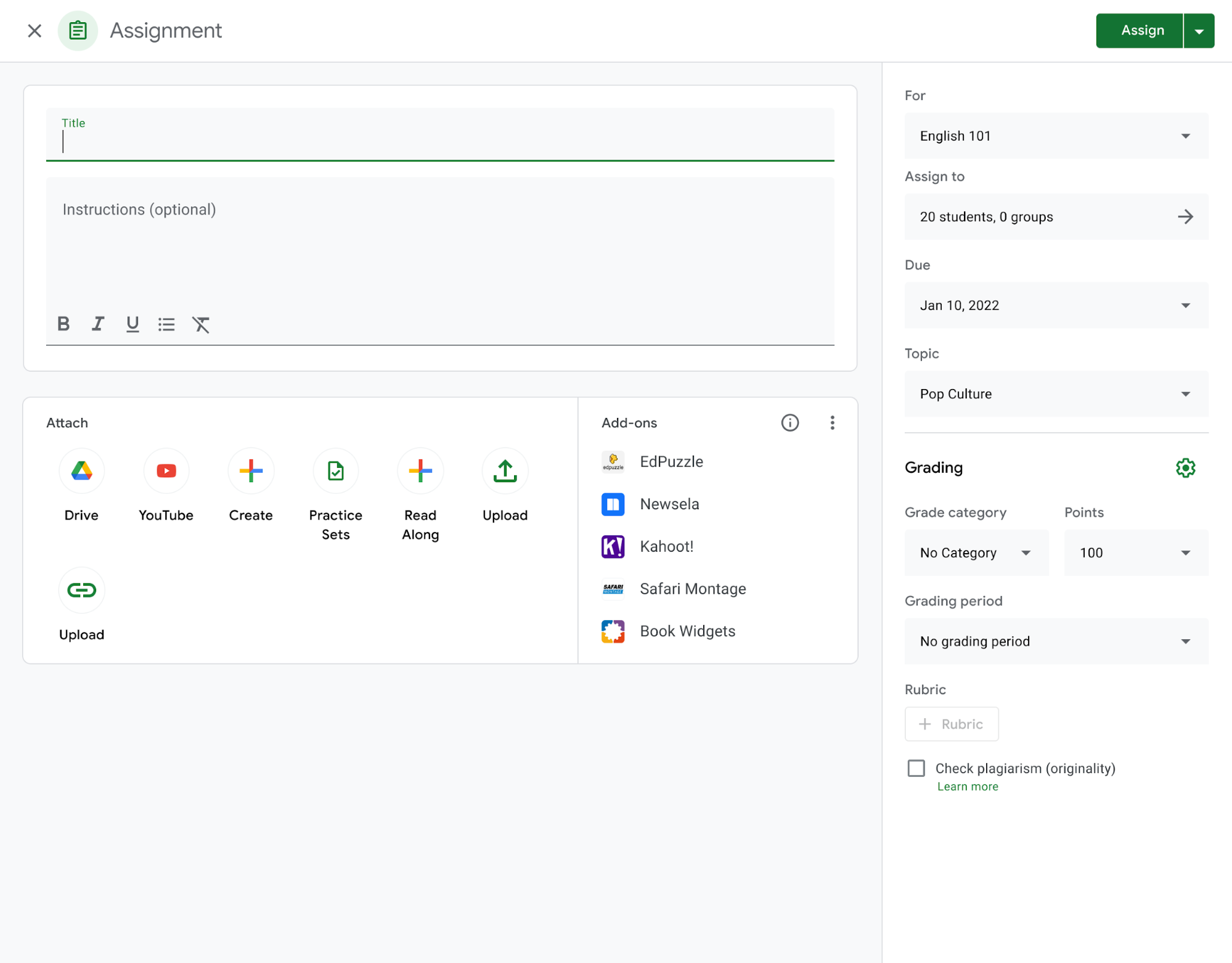
For assigning to a group that would live in the same page where you would create an assignment. Educators would simply create an assignment and choose which group they would like to receive it.
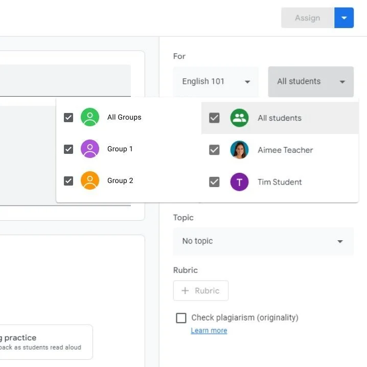
These flows went through many iterations. For example, when assigning to a group we added tabs for the groups and students. (Due to non-disclosure agreements I cannot show the exact previous iterations).
Concept Study
Even though there was plenty of foundational research to back up the need for student groups, I wanted to run a concept study. Many of us already had a large bias about student groups involving group projects and group work so this was a sure fire way to confirm if educators would want student groups for group work or differentiation. A way for us to confirm what the teachers actually want from this new feature.
Goal
Confirm our user’s expectations
Learn current grouping habits
Learn how current differentiation habits
Targeted Participants
Teachers
Currently using Google Classroom
Currently groups their students
What we learned
Teachers were highly enthusiastic about the new feature, with 100% affirming it meets their expectations.
Most participants group students by performance to tailor support and challenges, highlighting a need for better differentiation in Google Classroom.
Half use physical notes to track groups and are eager for a digital solution.
Mixed responses on where to find the feature leading to un creating an additional entry point.
Flexibility is crucial, as teachers frequently adjust groups, so the feature must accommodate various scheduling needs.
Number of Participants
10
Hi-Fi Designs
People Page
With all the information from the foundational research and the concept study we were ready to start making some hi-fi designs. For the sake of time, me and the lead designer decided to divide and conquer.
Since there were some concerns about discoverability on the people page, I would start working on that. We wanted our designs to be really scalable since some classes can have 1,000 students and originally with the groups section under the student list, teachers could never know it was there. I added these tabs for the students and groups section so it's easier to spot the new feature.
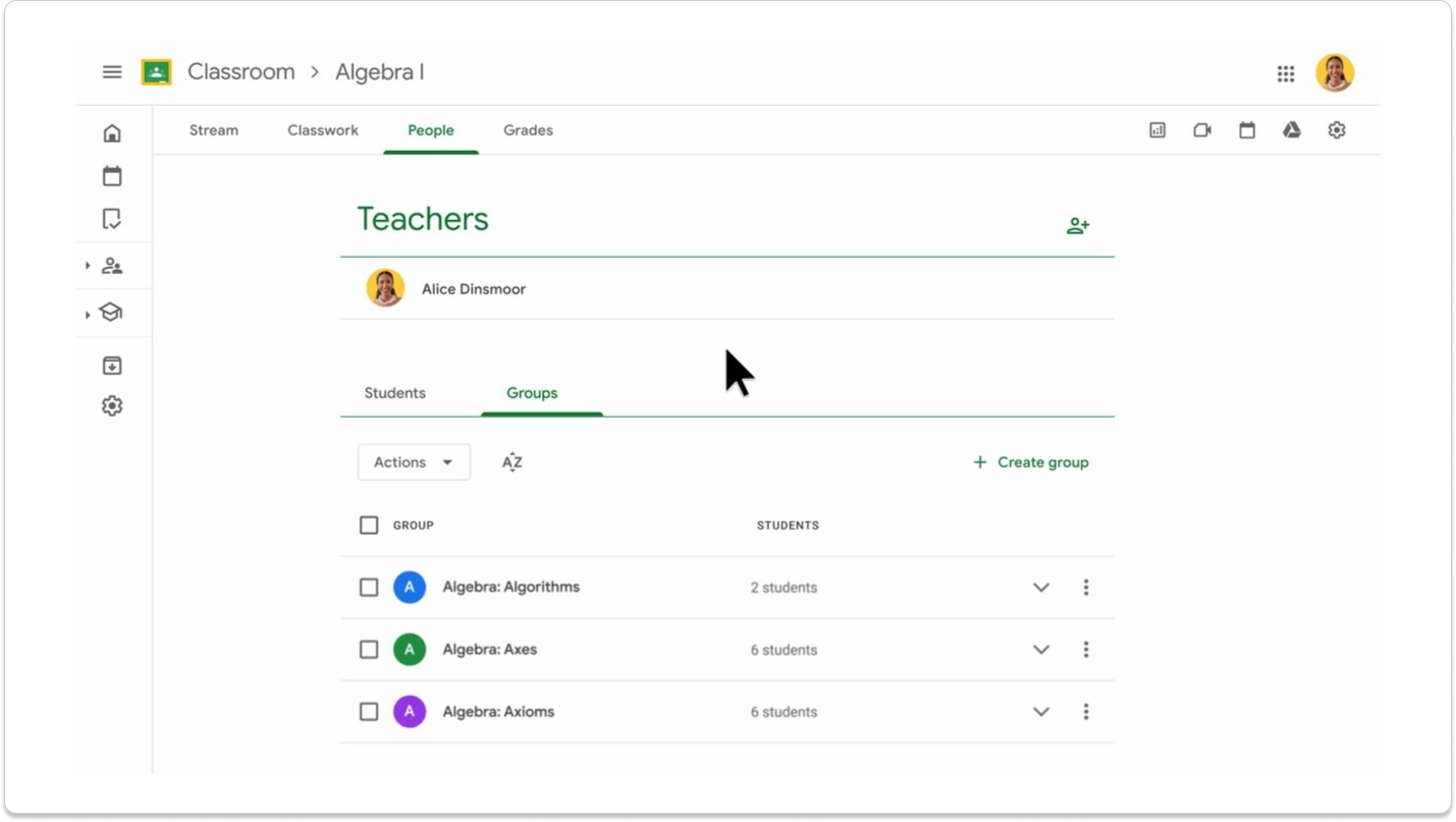
Assigning to a Group
While working on that my lead designer worked on assigning to a group. She came up with 2 ideas for selecting the group. We decided that we would each work on one of the ideas. After that we created a pros and cons list and made a decision.
Dialog:
Functionality: Opens a dialog with tabs for students and groups; allows creating, editing, and deleting groups.
Pros:
Focuses on selecting students/groups
Less engineering work
Matches People Page flow
Cons:
Teachers must close the dialog to edit the assignment
Less mobile web real estate
Larger interruption to flow
Side Panel:
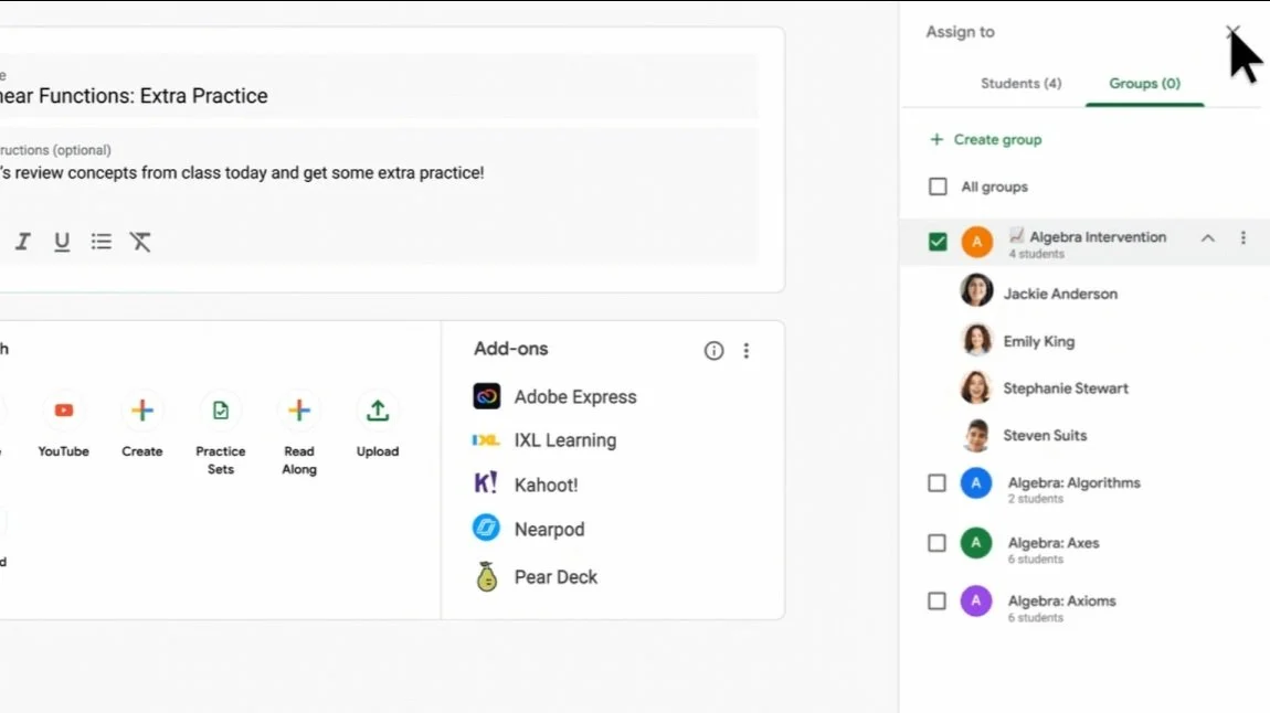
Functionality: Slides in a panel with tabs for students and groups; allows managing groups.
Pros:
Smoother flow
Allows editing assignment instructions while selecting students/groups
More mobile web real estate
Cons:
Slightly more engineering work
Inconsistent with People Page
After all this, we decided to use the dialog on the People Page and the side panel on the assignment creation page due to minimal engineering load differences and similar content/components.

The design is similar to this dialog but with tabs at the top for students and groups.
Usability Study
After lots of approvals and hurdles we got everything approved to move onto testing. I took the liberty to finalize all the padding, hover states, click states, etc. and created robust prototypes for all the major flows we wanted to test. These would be the closest to how we want the designs to run on the actual website.
Goal
Test creating a group
Test assigning to a group
Test discoverability
Targeted Participants
Teachers
Currently using Google Classroom
USA only
What we learned
All participants were extremely satisfied with the student groups featured shown in the test.
All participants found it very easy to find student groups on the people page and when creating assignments.
There was some confusion about grayed-out students after selecting a group, so we added a tooltip for clarification.
Participants expressed a preference for assignments to update automatically when groups are edited.
Number of Participants
14
Final Touches
Iterations
With the usability study comes iterations. We made some adjustments based on the feedback like adding a tooltip to explain why students were grayed out and disabled after being selected in a group. We made sure after selecting a group of students all the other students in the class would be deselected. And we worked closely with our UX writer to adjust some dialogs after editing groups that have assignments and various tool tips.
Mobile Designs
Due to NDA I cannot show the designs but Mobile is less frequently used on Google Classroom so on launch this would be a limited feature.
When creating an assignment, teachers cannot assign to a group.
When editing an assignment that already has a group added, teachers can see the students are added via a group (group name under students name) but they will be locked and will be redirected to a link of the mobile web version if they would like to deselect those students.

Implementation & Pivots
With everything pixel perfect and approved by the UX team lead, our engineering team began implementing everything on the front end. As with every good project, this is where a lot more issues came up.
As they were implementing the side panel on the assignment creation page, one of our engineers realized it would take significantly longer to have group selection, creation, and editing in the side panel, due to some issues persistent in the backend. Instead of pushing back launch we decided to have group and student selection in a dialog (as mentioned before) this would have the exact same content inside as the side panel.
Along with those changes there were some smaller constraints like how we would communicate when a teacher has reached their limit of students in a group or assignment. With these smaller challenges me and the lead designer would work with UXW to figure out the best way of communicating these constraints to our users.
The Outcome & Impact
The Final Product


Projected Business Impact
Measuring success:
Since the feature has not launched yet, here are our goals and projected targets.
Our topline metric for success is the adoption of student groups so this is what we want to track:
# of classes that student groups set up
# of teachers that are in at least one class with student groups set up
# of premium teachers assigning with at least one student group selected
Many of our users already use personalized assignments and 50% of those personalized assignments have the same individuals selected. I expect to see at least half of those assignments using student groups within the first year.
Google Classroom Impact
With this feature being available only to our premium users, this would also help our org wide goal of increasing premium feature adoption.
Google Classroom has shifted its focus for more differentiation in Classroom and personalized learning. This feature directly contributes to that since one of the main ways teachers differentiate is through groups. This feature paves the way for future differentiation in Classroom and without it, many of the other future features would be difficult for the teachers to use to their full potential.
Will update with more information after launch.